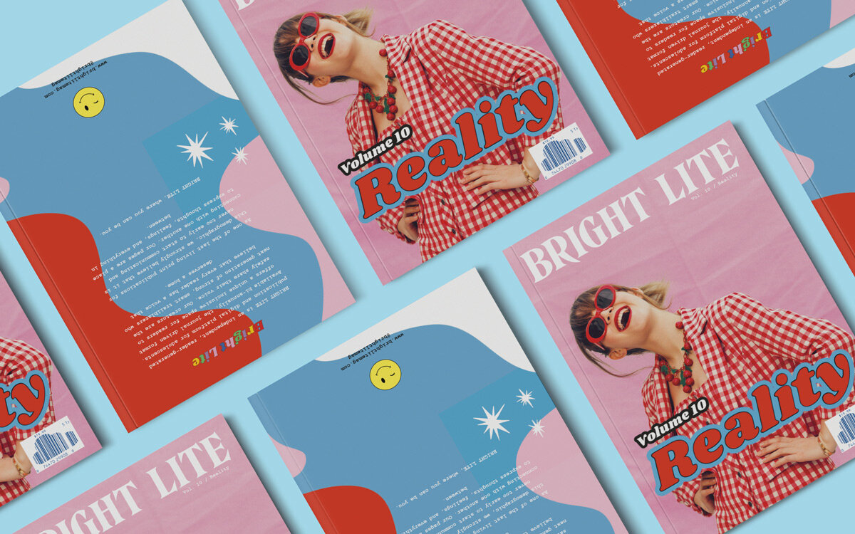
Bright Lite Magazine
01. Front and Back Cover Design
02. Interior Pages
03. Illustration example
Editorial Design. Graphic Design.
Hand Lettering.

This project consisted of working with the Editor to determine which submissions we would include, then jumping in to design the front cover. After its iteration project was complete, I set out designing the layout around the selected content and the thematic elements to be used in each spread. Next, I hand-lettered most titles, designed backgrounds, graphics, and more to highlight the different stories and develop a cohesive, yet playful theme across the entire publication. Finally, after many back-and-forths with the editor, we nailed down the layout together, I finalized the graphics, designed the back cover and spine, underwent countless editing nights, and we had our final design ready for print. This is my second volume with Bright Lite Magazine, a limited run magazine publication available online and at 70+ retailers, including Barnes and Noble and BAM Books.
01. Front and Back Cover Design
A fun and colorful take on the classic Bright Lite cover structure. The waves symbolize a fluidity in reality while the cover features Iris Apatow and teases her cover story, Reality Bites.
02. Interior Spreads
Some examples of interior spread designs showcasing editorial design, custom lettering, and poem/ song submission designs.
This volume was all about reality, and showcased submissions from over 30 adolescents. It went on sale April 2nd, 2020. Purchases can be made directly through brightlitemag.com and through various of their 70+ retailers, while supplies last.
01. Section Break Illustration & Magazine pack
Music section opener spread with photos of our musician interviewees, as well as an image from when I picked up a few copies when the first batch arrived.


